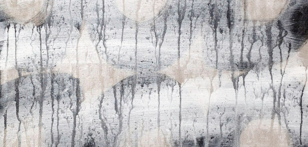
 66 Yellow | acrylic on paper | 30 x 40 cm (12 x 16″) | March 2016
I used to hate the colour yellow as a kid, primarily because my mother liked it. To me, yellow was gaudy, crass, loud, clumsy, potentially violent and unsophisticated. However, over the years I’ve grown to like it when I’m in the right mood. Yellow experienced a revival in recent times, and came to be considered a modern colour, particularly in contemporary design. Monet’s kitchen in Giverny is canary yellow, at least it was when I visited many years ago, and it was spectacular – I think that’s where I first began to appreciate this colour. It used to bug me that Vincent used yellow so intensely, but of course, its part and parcel of his mastery, which I’ve also come to appreciate over the years. However, for me, Turner’s yellow is especially special. This concludes my meditation on the colour yellow.
℘

I’m ambivalent about blue myself.