4 Oct 18
Playing catch-up… a collection of 6 shots taken at the Paris Picasso Museum this August. It was interesting to visit the museum almost one year later, it was great to see that every work on display had changed.
Picasso’s Figure 1927 was the work that made the trip worthwhile, a fabulous abstract painting. Verre, journal et dé 1914 is a collage of small objects displayed in a wall-mounted box frame – there is something joyful in viewing such a raw construction, it is simultaneously playful and thoughtful.
21 Sep 18
I’m back.
Paris Museum of Modern Art: my first visit to the PMoMA at the back end of August. I’ve posted a selection of my favourite works today, the permanent exhibition had a number of pieces that I found genuinely exciting.
The 1965 Georges Nöel painting, Palimpseste ‘Le Soir’, utilises the scoring technique, also used by Picasso, a technique I haven’t used for many years, and maybe time to revisit. The industrial feel of the horizontal banding is a great backdrop to the cuneiform style score, a juxta of ancient and modern, an impressive painting.
The 1929 Léon Tutundjian wall-mounted sculpture also reflects an industrial aesthetic with the minimal amount of elements – I spent ages looking at this. To think this was created in 1929, its crazy how ahead of its time this piece is – architecture, geometry, minimalism, abstraction, its all here, and it makes me want to make stuff.
It’s kind of crazy, and difficult to put my finger on exactly why Optophone II by Francis Picabia is so engaging… but it is! The target backdrop is a graphic dream overlaid with surreal elements: the Man Ray ‘eye’ a focal point surrounded by floating grapes, female nudes and scraps of chequer board.
The 1933 Composition abstraite by Jean Hélion was the first piece that greeted me as I walked through the front door, and it got my attention. It’s a relatively simple composition with graphic overtones, but its often the simple that is the hardest to achieve; working with minimal motifs, balance is critical if the piece is going to work. This is a great example of getting an abstract composition perfectly in balance, which is why this painting merits the perfect title.
I’m embarrassingly biased when it comes to Fernand Léger, I can’t help swooning a bit, having been a long-standing groupie of his work. I shot the 1918 Les Disques in black and white, expecting impressive results in terms of the graphic design, it is truly awesome. Léger uses explosive colour which demands immediate attention, however, this double-edge can detract from just how incredible this composition really is. When it comes to abstract works of art, this is up there for me.
Constellation aux cinq formes 1932… simply put, it’s a Jean Arp.
Obviously there is synergy here between Léger’s painting and Sonia Delaunay‘s body of work. The 1913 Prismes électriques is a magic quilt of colour, utilising geometry in a way that softens the visual experience and makes what could otherwise be hard to look at, weirdly relaxing.
Man Ray is a surrealist legend. Recognised more immediately for his photographic oeuvre, this is the first time I have ever seen a Man Ray painting in the flesh – he considered himself a painter above all. Surprise surprise, this painting is monochromatic. This was the cherry on the muffin… if anything makes me feel like an excited kid, this is it.
I had a tight time slot to get round the exhibition, but I’m so glad I went.
Remember, you can subscribe to my blog on the homepage margin, receiving updates as little or as often as you choose. Thanks for reading (I know you are because I can tell from my analytics ; )
6 June 18
Memory Mind: a series of 21 photographs, mostly taken on impromptu trips to Greece over the past ten months. A reflective group of images in what has been possibly the best and worst 18 months so far – a time filled with incredible highs and gut-wrenching lows, a roller-coaster ride would have been less precarious… but that’s life right? The Gods are having the mother of all spring cleans, many people and places have been relegated to the charity shop pile or the trash can, while the keepers arrive like dewy miracles in a desert of uncertainty – I say thank you for knowing me better than I know myself, and delivering what I need, not what I think I want.
Memory Mind runs in reverse time order – descending from the Thassos mountains after our family trip to Kastro, a mountain village and the oldest settlement on Thassos. Kastro was originally a rocky sanctuary from pirates (don’t we all need one of those?) where settlers arrived from the 1453 exodus of Constantinople, including my partner’s ancestors. Eventually, many came down from the mountain to settle in Limenaria, now a beautiful coastal town. One evening, my partner’s father, now 82, took us to his sublime olive groves at the foot of the Thassos mountains. He pointed out the different types of trees and told us about the history of the land, and how it had been passed down from generation to generation. Later, we stopped for a beer and watched the sun set behind the ocean. We talked about the Constantinople exodus and how it had scattered his family across the Greek islands, some even becoming victims of the war itself. Stone by stone, generation by generation, lives were rebuilt. Eighteen months after my own personal devastation, I could never have imagined that I would be sharing a beer with an 82 year old man, after the loss of his wife of fifty plus years, discussing his ancestors and their combined struggle – a humbling moment that put everything else into perspective.
6 June 18
Is it really June?
Today’s post: three images of the Karditsa Series in situ for the Eight From Nyne group exhibition at 45 Park Lane, showing until July 3rd. The preview evening was buzzing, an amazing turn out. It was a pleasure to meet the other exhibiting artists, I got talking to Joanne Hummel-Newell, Gillian Hyland and Ferris McGuinty. It was especially interesting to discuss our practice, and it continually surprises me to discover just how aligned our thought processes and methods truly are – a future blog maybe?
15 May 18
Collage 55: created in April, an antidote to working primarily with paint. I love the instant gratification with the process of collage, we can play around with the parts until they slot into place as a unified whole. Kraft-core offers the option of sanding the surface down to create the effect of ageing. I’ve included a monochrome image which focuses the eye on form over colour. I’m now pondering a series of these.
If you like collage, check out the work of Kurt Schwitters, my favourite collage artist. I was fortunate to catch an exhibition of Schwitters work during my time living in London. Naturally, the work on show was great, but what surprised me is the scale of his work, they are much smaller in reality than I imagined them to be, but no less engaging.
9 May 18
The Karditsa Series is now complete, a series of five large paintings previewing tomorrow evening on Park Lane, Mayfair, part of the After Nine Gallery artists collective exhibition.
I won’t lie, I’m knackered, five weeks of intensive painting, having prepped the canvases before my trip to Karditsa, Greece, with several layers of thin black acrylic. A black landscape awaited my return. The Graffiti photo series taken in Karditsa has been a major influence on this group of paintings, and a homage to my love of graffiti art. The graffiti influence melded with my original plan for this series – the concept of playing with geometric perspective and depth of field.
By the time I began work on the final painting, I realised that I had to revisit the first one, Karditsa III (named in hanging order, and not in the order they have been painted), since the paintings had progressed to a particular point of view, KIII was the odd man out. Already published in the exhibition catalogue, I was faced with a conundrum – to rework or not to rework. It was the last possible moment, and probably to the dismay of Jennifer Connor, After Nyne’s gallery director, I realised I had no choice, I had to rework it (sorry Jennifer!).
It was a risk, I had one day left, about as close to the wire as I’m ever likely to get. So in true graffiti spirit, I picked up a spray can, took a deep breath, and began painting over a significant amount of the original work. I huge risk, I had no time to start from scratch, I had to work with what I had.
I love obliterative painting, its exciting to see it in other artist’s work, and I often use this technique to sculpt the work, much in the way a writer uses the editing process – remove what doesn’t work. In the case of the painter, the deletion process simultaneously adds something new. Graffiti is often layered, which is one of the aspects I am drawn to. So armed with a black and a white spray can, I worked in the rhythm of the structure that was already present, carefully avoiding the elements that I wanted to keep. The quantity of paint going on the canvas gave me the opportunity to create runs, mirroring the runs in the ground work of the series. Karditsa III most closely reflects the inspiration I gathered from the graffiti shots taken early April, an explosion of layered curves, lines, geometry, weaving through one another, and so it hangs centrally within the series, pulling all elements together into one finalé – everything for a reason!
KI and KV are twinned, unconsciously drawing from my love of Russian Constructivism, I realise now, and remaining playful – less Lissitzky, more Kandinsky.
KII and KIV have a minimalist quality relative to the other three paintings, leaving plenty of negative space for the applied structure to breath, and a required contrast to the explosive nature of the centrally positioned KIII.
The Karditsa Series is monochromatic. I tend to work mostly with black and white, I enjoy the visual contrast as well as the philosophical nature of working with opposites. In this case, I really wanted to explore form rather than colour. Of course the next obvious leap would be to apply this approach with colour… maybe.
Painting this series has been a blast. After negotiating the traffic from Hampstead to Mayfair yesterday morning, handing over the paintings for hanging was a mixed bag of emotions – relief and trepidation in equal measure; the black and the white of it, the triangular, circular, linear and non-linear, like a bag of butterflies let loose in a hot house. I got back in the car, and drove four hours up the M1, to a bottle (or three) of wine with friends, while the butterflies found their resting place for the night.
29 Apr 18
At the end of most days I look for something inspiring to watch and chill out to, especially right now with 10 hour days working to complete the Karditsa Series for the upcoming exhibition. I’m a film junkie, but sometimes I need to absorb something rooted in real life, and turn to documentaries. Previously, I’ve expressed my frustrations about the lack of video interviews with creatives and fell back on watching Chef’s Table – the hardcore uncompromising mindset of the world’s top chefs, their innovation and commitment, is incredibly inspiring to me, and their approach analogous to the painting process. Just recently I discovered the Netflix series Off Camera, a series of interviews by Sam Jones. The stripped down simplicity of the monochromatic format with two people in a room exploring creativity at its core, is a gasping breath of oxygen. So much so that certain guests even comment on the refreshing change and thank Jones for his creation, inferring his prevailing sanity in an insane media driven world of sound bites. I think it’s Will Ferrell that expresses how great it is just to have a real conversation. It was a joy for me to watch Jeff Bridges in interview, one of my favourite actors (and a fine artist). I’m still working my way through all 3 seasons, in no particular order, but two of my favourite interviews so far are with Ethan Hawke and Dax Shepard. My brother got me into Richard Linklater movies over 20 years ago, so Ethan Hawke’s interview was especially interesting for me – his personal observations on life, work and the creative process are phenomenal, pure joy to watch. Dax Shepard was a surprise for me, I’m not familiar with his body of work at all, but man, I was riveted by his interview, a super-erudite conversationalist, this man is on fire – utterly compelling viewing. I can only hope that some day fine artists will be interviewed in a similar fashion, and not merely confined to the dusty shelves of BBC iplayer and obscure videos sold at Tate Modern.
28 Apr 18
I love music, I couldn’t live without it. Today’s playlist while I work, these tracks are among some of my all time favourites…
Psycho | Muse
Ball And Biscuit | The White Stripes
Play God | Sam Fender
Leave It Behind | Desert Mountain Tribe
Tyrants | Catfish & The Bottlemen
Iron Sky | Paolo Nutini
Property Of Jesus | Bob Dylan
So Beautiful Or So What | Paul Simon
Simple Man | Lynyrd Skynyrd
27 Apr 18
Currently working on the Karditsa Series of 5 paintings for the upcoming Mayfair exhibition, while my present unpleasant experience currently descends into something akin to the Dawes video, Roll With The Punches, life becomes somewhat complicated. My work, consciously or otherwise, appears to reflect this surreal period – art mimics life. Bold graffiti strokes poeticise my current fuck you attitude, crystallising from almost 2 years of inconceivable nonsense and a punch for freedom from a miserable marriage, while the geometry, simultaneously and deliberately haphazard and meticulous, reflects a messy new-born order from personal armageddon. Monochrome FUCK U’s and geometric one-dimensional assholes, transform into complex layers of perspective and a deeper appreciation for the difference between bad and good, dark and light. While the Karditsa Series references the inspiration I received from photographing graffiti during my recent travels, in earnest, a more truthful title punches through the canvas…
LIGHT TRUMPS DARKNESS MOTHERFUCKER.
8 Apr 18
GRAFFITI II: Karditsa, Greece
Full technicolour. So while the black and white shots tend to focus the mind on composition, structure etc., Graffiti II unapologetically celebrates wild, explosive colour. My camera has a reasonable effects setting, so the images you see here are mostly what fell out when I shook it, with the exception of K52, which is a negative image.
Next move: combining graffiti inspired ideas with geometry in my painting. I’ve never used spray paint in my work but have been thinking about this again recently.
GRAFFITI: Karditsa, Greece
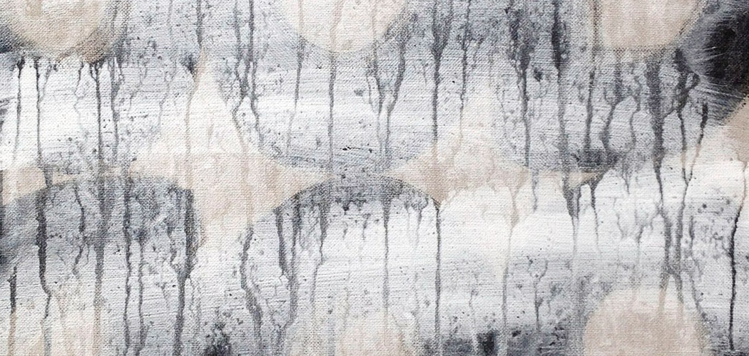
I’ve always loved the anarchic nature of graffiti, I photograph it at any given opportunity. Visually speaking, graffiti has graphic value in the bold strokes and strong colour, layers of dynamic shapes and lines softened only by the diffused paint quality from the nozzle of a spray can. This monochrome series has been edited from hundreds of shots, taken at an abandoned building near the Karditsa train station in Greece. Even when there are pictorial and language elements in the graffiti, the result is often highly abstract. The canvas of cracking paint and plaster, wood and metal contribute to the depth of texture. The obvious spontaneity combined with multiple layering of paint is ultimately what excites me the most. I’m sure the locals thought me quite odd photographing a ruin in the hot sun, yet these are some of the most inspiring graffiti shots I have taken to date.
17 Mar 18
BLACK CIRCLES: completed today.
The three black circles are formed using direct print, a risk when adding as the last detail, because the texture and outcome are a little unpredictable. Direct print contributes a different type of texture, the circles are not perfectly formed, nor perfectly aligned, which leaves the painting feeling slightly unresolved, yet more interesting. Scraping paint away from parts of the circles create opportunity for geometric play and small detail. The linear frame wraps around 2.5 times at slight angles to create subtle perspective in an otherwise flat painting, a detail I’m increasingly working with, I enjoy the paradox. The ground work appears as three layers merging, but is actually made up of five or six. The layered and textured ground, slight shading in the demi-circle, linear framing and hovering black circles add depth, while the essential nature of the painting remains flat.
There is something primal about working with geometric shapes, after almost twenty years of abstract painting, I inevitably gravitate back to working with geometry and its organising aspect.
Stranger times than ever right now, my closest friends lost their sister recently, and my partner lost his wonderful mother, within days of one another. Never has there been a time of greater contrast or polarity. I’ve lived on my own now for a year and a half, I have a lot of time to ponder the bizarre nature of life, but when I paint, time stops and thoughts suspended – if ever a reason was needed to be creative, surely it’s to transcend the loud protestations of the mind.
Unresolved, yet more interesting.
1 Mar 18
The big painting: SIX SHAPES.
Squaring the circle. A light square on dark, and a dark circle on light. In between, halving of the circle, stacked, and a morphing of a square and half circle. The morphing shape is like a pool of water, the dark circle reflected at its edge, reflecting. The rectilinear framing adds subtle perspective, enveloping the circle, the reflection and the morph. All five shapes are touching, only the square hovers slightly apart, framed by the darker texture. Monochromatic, apart from the smallest shape, a circle and a pivot, picked out in red, a focal point. A painting of opposites or contrasting elements, the opposition is rendered benign by the harmonious whole. The big picture. From opposition flowers harmony.
The number 6 in Tibetan numerology represents Harmony.
1 Mar 18
Opening to experience, within the soul. As the old experience falls away like shedding skin, the renewal invites a greater, more magical experience to flood in.
The big painting is almost finished. Then, a new train of thought.
28 Feb 18
Line + SOLIDS: completed yesterday, a rework of a recent painting, from negative to positive. The double rectilinear framing provides subtle depth and some perspective to the otherwise flatly painted solids, creating a visual paradox that I quite like.
I also quite like the snow. Next… March. Now working on a bigger painting.
26 Feb 18 part II
Challenges to the Creative Process
…aka LIFE. We all face challenges, it is part of the human condition, and challenges come in every conceivable form. Like so many, my most recent challenge is in experiencing a difficult divorce. There is a view that the creative process can be enhanced when challenges arise by channeling our emotions into our work, assuming that we are not impeded by physical challenges such as a debilitating illness. However, I discovered that emotional pain can be equally debilitating. The I Ching states that we should aim to achieve Tranquility in Disturbance, i.e. ignore the avalanche of drama and do it anyway. I believe Salvador Dali had a similar view. This particular wisdom is a sword with two edges; we can understand the truth of the view, and yet this view may cause additional pressure in an already pressurised situation to ‘get our shit together‘, when perhaps we are not ready to do so.
Speaking personally, I require peace and ideally a certain sense of joy to be at my optimal best when painting. Almost a year and a half later, I am only now truly getting back into the studio and producing work again. Sure, there have been sporadic moments of creativity, only to ping back like a rubber band into the ‘wtf just happened to my life‘ state. I realised that the rubber band effect is a part of us that operates not from the mind but a deeper sense of self. Allowing oneself space to move through difficulty at our own pace may ultimately be the most expedient way to heal. Forcing ourselves into any kind of action, especially one that is meant to be joyful, is like whipping a lame race horse to go faster down the track, the horse becomes miserable, the condition worsens, and what was once a full tilt joyful experience becomes a fear by association. We have to be ready, to reassume the mantle.
So, the challenges continue, of course, because this is the nature of living life, yet something has fundamentally changed. As the sense of overwhelm subsides, a heightened strength emerges, whereby the push-pull of life no longer seems so pushy, we become less phased by the rocking of the boat, looming storms don’t send us into blind panic any longer, in fact we welcome the approach with a knowingness that not only can we handle it with a new found inner strength, but that this too shall pass… and that is the true meaning of Tranquility in Disturbance.
26 FEB 18
Circle + LINE began as composition over two years ago. The elements, while interesting, overpowered the composition, essentially there was too much going on, and so I walked away from this work until such time as I could experience it in a fresh light. Working on this painting over the last few days became a process of mostly reducing the elements, only fragments of the original are still visible. The work has now come into balance, the new space created allows for greater focus on the elements that remain or have since been added. Obliterating parts of a work provides opportunity for increase in texture. Scoring into the central area while plastic enabled the gestural mark making, subtle so as not to overpower, enough to leave an impression once the direct print block had been applied, what I think of as the cement block, pointing to a kind of architecture. The cement block, while controlled in application, leaves space for chance, and brings out the surface texture that may otherwise have gone unnoticed, and so the underlying sweeping brush strokes come to life, framed by the block.
22 FEB 18
A day of updates, including Artist’s Statement. After many years of skirting around the issue, a statement about why I don’t like statements.
GEISHA photographed successfully, with minimal colour correction. Not every painting loves a camera lens. Like many of my paintings, this is a re-work. I have a mountain of canvases in the rework pile, some of them years old. They sit there until one jumps out, ready for completion, and not always successfully – some have to be abandoned all over again until the next time, but only after I’ve kicked them around the studio for good measure. GEISHA combines many of my favourite elements. The ground work is a graffiti sprawl directly onto linen, overlaid with semi-transparent geometric planes, reminiscent of textile. The Sharpie in the ground cuts through several layers of acrylic, allowing for elements to be picked out in white, and brings in the constructivist element that I have experimented with for many years. Essentially, the original has been simplified by obliterating most of the detail, only parts rise to the surface, allowing focus on the more interesting aspects.
Another old canvas resurrected today, while working on it, reminding myself of why I abandoned it in the first place. Individual elements good in themselves but don’t work as a composition. In the end I’ve obliterated all but a few details. There comes a point when I’ve been staring at the canvas for too long and become snow blind, I have to walk away. Tomorrow I will know more.
